Reporter's Notebook is Retail Dive's ongoing series in which reporters and editors visit the retail industry's brick-and-mortar locations to gain on-the-ground insight into retail trends.
If you can get a customer in a dressing room, you are more likely to make a sale.
Fitting rooms, "are extremely important to the retail experience. I think they're as important as the front of the house, if not more so," said Diane Gatterdam, owner of international store design and visual merchandising company Creative Consultant Studios, in an interview with Retail Dive.
There is innovative technology hitting the market that aims to make the dressing room experience more magical and helpful for the customer. H&M tested voice-activated mirrors at its New York City flagship. Beauty lovers can "try on" makeup virtually at CoverGirl's retail location. Many retailers started toying with installing tablets in dressing rooms years ago so customers can browse through additional sizes and outfit ideas, or to order products online in an effort to bridge the online and offline experiences.
But, the reality is that there is a large gap between the promise of technology and what is currently happening in retailers' dressing rooms. While some physical stores have embraced what will certainly become normalized tech in the future, most brick-and-mortar locations are struggling to cover the essentials of providing a clean space with decent lighting where customers feel welcome — and aren't continually being eyed as potential thieves.
"A lot of stores think that it's a shrinkage problem. So they almost look at the dressing room as a negative," said Suketu Gandhi, partner in the digital transformation practice of A.T. Kearney, a global strategy and management consulting firm. Even a customer getting handed a card with the number of items that are being carried into the fitting room can potentially create a negative association with the brand.
"Let's say if you have a 2% shrinkage problem, that means 98% of your customers are there to buy something. That means you're going to treat the 98 as thieves versus customers." said Gandhi, noting that he was exaggerating, but not by much. "So in addition to the way it is laid out, the lack of support in there and the way it looks, there is also a terrible, negative element of people thinking that people go in there to steal."
This ultimately means that if retailers are going to give customers a bad experience, the smarter way to do business may be to eliminate the dressing room altogether.
If retailers decide to hold on to those spaces, though, simplicity may win the day. "The ones that I'm most impressed with, the lighting is good. It's clean. And there's really great store associates kind of hanging out and they're friendly," said Gatterdam. "There's also kind of something that's really basic of, it's just a comfortable space to be in."
Dressing rooms also could position a company better to reframe the brand while pointing to the continued importance of brick-and-mortar locations. Retailers typically allocate 20% of their physical space to dressing rooms, Gandhi explained. "If somebody told the CEO that 20% of your assets are dead, fully underutilized or misused, what would they do?"
In order to understand the reality of dressing rooms, here is a glimpse at eight different retailers in the Washington, D.C. area and their approach to the experience.
Macy's
This Macy's location receives more of the experimental elements of the retailer's offerings. It currently sports the Backstage, Story, and ThredUp concepts inside.
While the brick-and-mortar location hints at the future of the retailer, there are signs of issues with the simpler elements. The dressing room space was blocked off by both a retractable belt and a chair next to a sign about accessibility. Behind the rope was a disheveled return rack. Was it quickly closed off to clear up a problem or temporarily shuttered for another reason? Or had no one returned to it to clear out the room?
It should be emphasized that this was not a search for the most questionable dressing room in a store. It was picked at random.
Aerie
Aerie's parent company, American Eagle Outfitters, has been doing some holistic thinking about its brand presence, including in its dressing rooms.
Earlier this year, the teen apparel retailer revealed that it was testing interactive fitting room technology in select San Francisco, Boston and Las Vegas locations. Shoppers can utilize touch screens to scan items, look up product information, request additional sizes, calculate costs and see in-store inventory.
However, what jumps out about the space doesn't involve technology at all. Rather, it is found through sticky notes and consistent brand messaging. The retailer has taken market share away from rival Victoria's Secret in part due to its messaging of body positivity and empowerment. That ethos is continued in the dressing room space where customers can leave encouraging words to fellow shoppers on the mirrors.
The company tells shoppers to focus messages on "REAL, inner beauty — strength, intelligence and beauty within," and to "go beyond physical compliments." The dressing room strategy, which first appeared in 2017, still remains remarkably effective in its simplicity.
In another simple but efficient move, the room also sports a button customers can push if they need help or additional sizes.
Pink / Victoria's Secret
Victoria's Secret is at a turning point. While the rest of the world seemed to evolve, the company dug in its heels regarding product marketing and stuck with messaging that has been widely panned as oversexualized. The company is slowly starting to make changes.
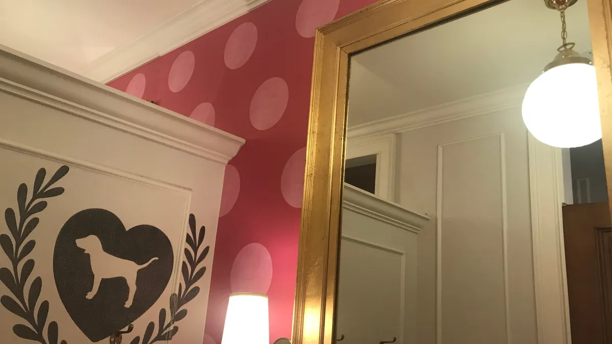
That's why the fitting rooms at Pink were a bit of a surprise. The company has clearly thought through the customer experience and points of interaction. The dressing rooms are merchandised to feel as if the customer has walked into someone's closet. The individual stalls have big mirrors, soft lighting and space to place belongings — either on hooks or on a chair.
There are small touches here, too. Like Aerie, there is a button that can be pushed so customers can request to speak to a sales associate. There is also a small box that holds individually wrapped disposable underwear for use when trying on garments.
Pink also uses dressing room doors to provide product touchpoints. Outfits hang on doors so customers can see how items go together or spark inspiration regarding what to try on next.
Forever 21
While Forever 21 recently filed Chapter 11, that doesn't mean all of the physical stores will simply disappear. The company landed new agreements with over 100 vendors so products will continue to be delivered to stores in the coming months. They are also continuing to hire associates for the busy holiday season. Thus, fitting rooms continue to play a role in the company's uncertain future.
Individual stalls are clearly numbered, making it easy to shuffle people in and out of rooms. The numbering can be beneficial due to the size of both the physical stores and crowds (especially on weekends).
But, the floors and walls in the DC store were in need of a deep cleaning.
Forever 21 does appear to be thinking of its touchpoints. Mirrors have company branding, with the web address displayed and information on how to text the company to receive 20% off when applying for a Forever 21 credit card.
Altar'd State
Altar'd State is an apparel and homegoods retailer with over 100 stores in 30 states. The company also has a faith-based mission that shows in various ways throughout stores and online. It carries products containing Bible verses and its mission, as explained on Instagram, is "giving women a unique shopping experience full of fashion, faith & giving back."
The brand's identity shows up in subtle ways through its dressing rooms. The doors are oversized and solid (like those you would find at the entrance of an old church). They also contained two glass pieces (one above the door, and one propped up on the floor) that were reminiscent of glass windows one might find in a building of faith.
Sales associates ask customer's names and write them on the outside of each fitting room. The conversation overheard between associates and customers was light, positive and encouraging. It felt like an authentic extension of the brand.
Zara
Dressing rooms at Zara are long and rectangular, with heavy curtains separating shoppers from the hallway. The curtains are also hard to close completely even after several attempts, making it a difficult design for modest customers. The remaining space is covered in mirrors, in an attempt to make it look larger and allow for customers to see apparel from various angles.
The rooms aren't completely cleaned out between customers. Clothing and hangers can linger behind, leaving the next person to move product or items around to clear out space for their own clothing. It obviously has something to do with volume, too, with large crowds of people floating in and out of tight spaces and sales associates attempting to keep up with go-backs.
The experience feels utilitarian, but in a way that may work with the larger brand. If the customer is getting stylish clothes at a reasonably-low price it may be a fair trade-off to temporarily be in a cramped space. But, how much could Zara increase sales if the customer was even slightly more comfortable?
Nordstrom
The dressing rooms at Nordstrom delivered a more refined experience with large, clean rooms and lots of mirrors. Art decorated the walls in the hallway.
But, getting to the actual space was confusing. There were two dressing rooms, both of which were in-use. The door to a storage room was open, allowing a peek at inventory, bringing to mind what A.T. Kearney's Gandhi had said in an interview: "a dressing room is not a storeroom."
There was also a customer who was sitting down and addressing someone, obviously in the middle of an appointment. She was partially hidden from view by a wall. But, it wasn't clear what to do and there wasn't anyone around to ask. As it turns out, there were more rooms past the shopper who was mid-styling session, but the layout wasn't intuitive. (Are customers supposed to walk through the middle of a discussion and hope that there are more dressing rooms on the other side of where appointments are taking place?)
A sign on the dressing room wall stated that associates were monitoring rooms, making it clear that even in the middle of a warm atmosphere customers are being watched.
Marshalls
When shopping at a discount retailer, a stripped-down dressing room experience might be expected. Marshalls proved to be straightforward but cheery. Customers are given a tag for their number of try-on items, and the messaging of "treats for my closet" is on-brand, as the TJX family is known for its treasure hunt approach to retail.
The room had space to hang lots of apparel, and hooks in different parts of the room where a customer could organize potential purchases according to "definitely," "possibly" and "tomorrow" (which sounds like a nice way to say "no").
It also had diffused lighting on either side of the mirror, which sported a sticker that explained that customers could go online to find more products — a new shopping channel for the retailer as of this September.
Marshalls also had a much larger family dressing room option, and a place to park carts prior to entering the dressing room area, thereby solving a logistical issue of what to do with non-apparel products and lowering the potential for shrink.


